 Friday, May 17, 2024
  Friday, May 17, 2024
As reported on CBC News, cold, grey, and dull.
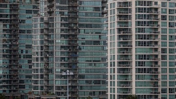
I’m not talking about Vancouver’s weather — I’m talking about its architecture.
Just take a walk along False Creek or Coal Harbour and you’ll find yourself surrounded by towers of glass in various inoffensive shades of light grey, blue, and that iconic seafoam green. But what about the rest of the colour spectrum? Why are Vancouver’s buildings so lacking in colour?
To answer this question, I started with a recently constructed condominium building called the Arc. You might have noticed its silhouette: a curvy, two-tower condominium development resembling a coffee maker next to the Cambie Street Bridge. The whole thing is covered in neutral blue glass, like nearly every other building around it. But this wasn’t the original plan.
The first design for this site, submitted to city council in 2014, looked much different. Sure, the building itself doesn’t look too special, but there’s one thing that stands out right away — the colours!
It raises the question, how did we go from a rainbow mosaic to a monochromatic wall of glass? What happened?
To find out why buildings like the Arc meet an invariably grey fate, I reached out to a number of architecture firms in the city, as well as the developer, all of which declined my invitation to talk.
A representative for the City of Vancouver did take the time to write and said the Arc development was approved by the general manager of planning at the time but the city does not regulate which colours can be used.