 Tuesday, October 1, 2024
  Tuesday, October 1, 2024
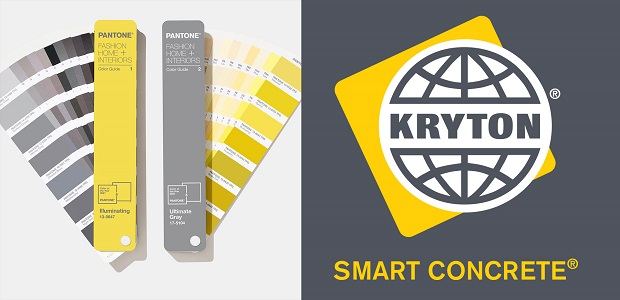
In December of last year, the world got to see Pantone’s colors for 2021 for the first time. Since 1999, Pantone has been choosing a color of the year, subsequently inspiring architects, advertisers, and designers across the globe. However, this year was a little different. Pantone, for the second time ever, chose to go with two colors instead of one. But what intrigued those of us at Kryton more was that their chosen colors represented Kryton’s own colors of yellow and gray.
When Kryton chose those colors for rebranding, it was not just to capture interest with the eye-catching highlight of yellow against gray. It was also to give people that feeling of reliability and strength that construction so often reflects through the safety of yellow hard hats and the durability of gray concrete foundation. (You can easily see this theme run throughout our website and our blog.)
Pantone clearly had a similar train of thought for the colors. On their website, they mentioned that people feel the need to know that better times will come. And that’s why they chose yellow and gray. Both colors provide a feeling of stability, with yellow bringing a sense of warmth and optimism and gray adding a practical, rock-solid side.
We’re not the only ones who recognized the appeal of these colors either. A number of architect publications have published articles on the colors for 2021, including the Architectural Digest.
Does that mean that Pantone’s colors have an impact on architecture? While color selection is not the first or only focus for an architect, we here at Kryton believe that there may be good reason to give it its 15 (or more!) minutes of fame.
As an associate of Cambridge Architectural Research Ltd. points out, color, more specifically, exterior color, has always been a part of architecture, but its role has been particularly small. He goes on to mention that even empirical research on exterior color is limited with ambiguous results to show for it. An author from ArchDaily makes it even clearer that color in general is something that some architects tend to be wary of. And even the National Council of Architectural Registration Boards suggests that architects and architectural schools seem to avoid focusing on it as a topic.
But why is that?
Well, all three sources suggest a number of reasons.
For instance, the author from ArchDaily mentions that architectural instructors often teach architects to focus more on architectural elements like form, space, and materials. After all, as he suggests, it’s easier for the owner of a building to give the structure a new color than it is to fix anything structural like placement.
Not to mention, the choice of color can be a highly subjective one. As the architectural consultant and author Frank Mahnke puts it, it “is a sensory perception, and as any sensory perception, it has effects that are symbolic, associative, synesthetic, and emotional.” Each of those effects is going to be somewhat different based on the person viewing the color and what cultural associations they assign to it. That can make it difficult for an architect to defend their choice. So it might be easier to stick to the more popular exposed finishes.
And in the case of exterior colors, there is another practical reason to keep them less colorful. Outdoor environments can cause a lot of wear and tear, making exterior colors fade. Depending on the shade of color, that fading can be very obvious. In light of that, architects prefer to use durable materials like concrete blocks, bricks, or terracotta that can withstand the wear. These materials also happen to come in colors that don’t show any obvious fading, such as gray, beige, and other earthy shades.